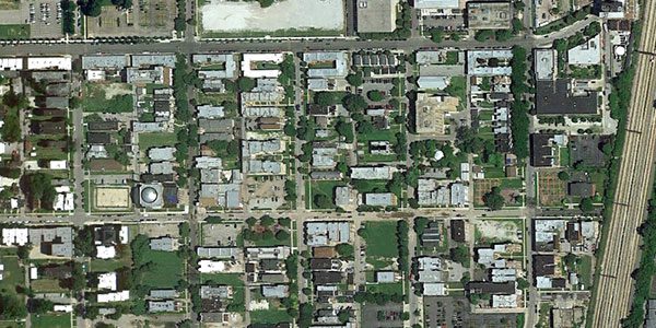
Income inequality, as seen from space
May 24, 2012 by Tim De Chant
Last week, I wrote about how urban trees—or the lack thereof—can reveal income inequality. After writing that article, I was curious, could I actually see income inequality from space? It turned out to be easier than I expected.
Below are satellite images from Google Earth that show two neighborhoods from a selection of cities around the world. In case it isn’t obvious, the first image is the less well-off neighborhood, the second the wealthier one.
Click here for full story + more cities from Google Earth

